How to Build Responsive Pages with CSS3 Flex Box

Demand for responsive and flexible websites in the market has forced web designers and developers to make “content the hero” and enable customers to navigate the content easily. So to accomplish this task, the new-era developers are employing Flex boxes that help create flexible layouts optimized for both web and mobile devices.
What is a Flex Box?
The CSS3 Flexible Box layout model (Flex box) is a relatively new front-end feature to create flexible webpages and grid-based layouts without relying on inline-block elements or floats. Flex boxes make building a responsive website with a flexible design much easier.
Flex boxes can be used for creating photo galleries and catalogs and even to create entire web page layouts with design flexibility.
However, most designers refrain from using flex boxes because of apparently lack of browser support. But in December 2015, CSS3 flex boxes were fully supported globally on around 81% of all browsers. So if a web designer is fluent in HTML, then the remaining browsers can still read the flexible webpage, but users may not be able to see that detailed layout.
Here is how you can create a flexible website with a responsive layout using Flex boxes. Also, all these steps are done under 100 lines of CSS.
Building responsive layout using CSS3 Flex Boxes
The basic wireframe uses a responsive and flexible design to alter the layout according to the devices—one column in small devices like mobile phones, two columns for wider screens like tablets, and three columns for large-screen devices like desktops.
Here is the standard HTML used:
<!doctype html>
<html lang="en">
<head>
<meta charset="utf-8">
<title>Page Layout with Flex Boxes</title>
<meta name="viewport" content="width=device-width, initial-scale=1">
<style>
</style>
</head>
<body>
<div class="wrapper">
<header class="header">
<h1>Header</h1>
<nav>
<ul class="navigation">
<li><a href="#">Home</a></li>
<li><a href="#">About</a></li>
<li><a href="#">Products</a></li>
<li><a href="#">Contact</a></li>
</ul>
</nav>
</header>
<main class="main">
<article>
<p>Lorem ipsum dolor sit amet, consectetur adipisicing elit, sed do eiusmod tempor incididunt
ut labore et dolore magna aliqua. Ut enim ad minim veniam, quis nostrud exercitation
ullamco laboris nisi ut aliquip ex ea commodo consequat. Duis aute irure dolor in
reprehenderit in voluptate velit esse cillum dolore eu fugiat nulla pariatur.
Excepteur sint occaecat cupidatat non proident, sunt in culpa qui officia
deserunt mollit anim id est laborum.</p>
<p>Lorem ipsum dolor sit amet, consectetur adipisicing elit, sed do eiusmod
tempor incididunt ut labore et dolore magna aliqua. Ut enim ad minim veniam,
quis nostrud exercitation ullamco laboris nisi ut aliquip ex ea commodo consequat.
Duis aute irure dolor in reprehenderit in voluptate velit esse cillum dolore eu fugiat
nulla pariatur. Excepteur sint occaecat cupidatat non proident, sunt in culpa
qui officia deserunt mollit anim id est laborum.</p>
</article>
</main>
<aside class="aside aside1">Aside 1</aside>
<aside class="aside aside2">Aside 2</aside>
<footer class="footer">Footer</footer>
</div>
</body>
</html>
The two breakpoints of CSS adjust how the boxes flex:
body {
padding: 2em;
}
/* navigation */
.navigation {
padding: 0;
list-style: none;
margin: 0;
background: #25a400;
display: flex;
flex-flow: column wrap;
justify-content: space-around;
}
.navigation a {
text-align: center;
padding: 10px;
border-top: 1px solid rgba(255, 255, 255, 0.3);
border-bottom: 1px solid rgba(0, 0, 0, 0.1);
text-decoration: none;
display: block;
color: white;
}
.navigation a:hover {
background: #87d76f;
}
.navigation li:last-of-type a {
border-bottom: none;
}
/* main layout */
.wrapper {
display: -webkit-box;
display: -moz-box;
display: -ms-flexbox;
display: -webkit-flex;
display: flex;
-webkit-flex-flow: row wrap;
flex-flow: row wrap;
font-weight: bold;
text-align: center;
}
.wrapper > * {
padding: 10px;
flex: 1 100%;
}
header.header {
padding-right:0;
padding-left: 0;
padding-bottom: 0;
}
.header, .main {
background: #ffffba;
}
.footer {
background: #25a400;
}
.main {
text-align: left;
}
aside {
background: gold;
}
/* medium sized screens */
@media all and (min-width: 600px) {
.navigation {
flex-flow: row wrap;
}
.navigation a {
padding: 1em;
}
.aside {
flex: 1 auto;
}
}
/* large sized screens */
@media all and (min-width: 800px) {
.navigation {
justify-content: flex-end;
}
.main {
flex: 3 0px;
}
.aside1 {
order: 1;
}
.main {
order: 2;
}
.aside2 {
order: 3;
}
.footer {
order: 4;
}
}
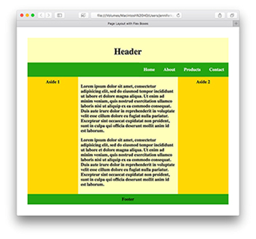
Thus will produce the following layouts:
Flex box layout on a large screen
Flex box layout on a small-sized screen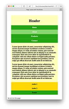
Flex box layout on a medium-sized screen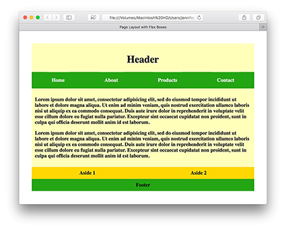
Flex Box container
An important part of the Flex box model is to define a flex box container. The container is the element that holds all the flex box items. Now you need to give the container a flexible layout using display: flex;
This will then display on the page as a block element with all the items inside it as flex boxes.
The CSS flex container properties are:
- Flex-direction: this is used to specify the flow direction of boxes—whether vertically or horizontally by using the flex-direction property. This property is applied to the parent, not the children. Possible values include row (the default), row-reverse, column, and column-reverse.
- Flex-wrap: This property specifies whether the flex items should wrap or not, depending on if there is enough room for them on one flex line. The possible values are nowrap (the default), wrap, and wrap-reverse.
- Flex-flow: The flex-flow shorthand property which is used to define the above two properties in the easiest way using flex-flow: flex-direction flex-wrap;
- Justify-content: This property is used to align the flex items. The values of justify-content property adjust how the elements align horizontally are:
- flex-start
- center
- space-between
- flex-end
- space-around
- Align-items: The align-items property is used to align the flex items. The values for this property are:
- flex-start
- baseline
- center
- stretch
- Align-content: The align-content property is used to align the flex lines instead of aligning flex items. It modifies the behavior of the flex-wrap property.
- Order: it specifies the order of a flexible item relative to the rest of the flex items inside the same container.
- Display: this property specifies the type of box used for an HTML element.
- Flex: It is a shorthand property for the flex-grow, flex-shrink, and flex-basis properties.
The flexbox specs have been updated many times since the original release in 2009. Current 2015 specs run on all modern browsers, and HTML5 web apps can benefit from the flex box model.
Flex box is capable of building a responsive and flexible webpage. Thus every developer should be acquainted with its abilities to provide a responsive layout build using CSS3 flex box that is compatible with a desktop, mobile, and tablet.