Build a Responsive, Flexible Site with Flexbox Or CSS Grid

Flexbox Versus CSS Grid
CSS Grid and Flexbox share a lot of similarities when designing a flexible site. Both are used for the layout of web pages. Both techniques are much more powerful than any other webpage layout technology available out there. Flexbox and CSS Grid can position, stretch, shrink, and align things.
We could often use either or both and plenty of situations when one is more well-suited than the other. This post will focus on the differences that make one of these layout techniques better than the other.
CSS Flexbox has become very useful to front-end developers. It makes it easier for developers to create dynamic layouts and properly align content within containers. Then, there is CSS Grid which does the same things Flexbox does but with more flexibility.
With all these, there is a lot of confusion surrounding these techniques. Let’s read on to know how both differ from each other and how to decide on one technique based on your needs.
What is Flexbox?
For a long time, positioning and floats were used as reliable tools to create CSS layouts across browser-compatible tools. But, their tools were limiting, making it difficult to achieve some particular functionalities. That's when the flexbox stepped in!
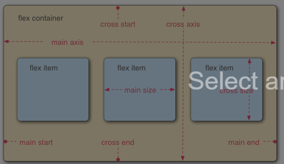
Flexbox is a one-dimensional layout that provides a more efficient way to layout a web page.

It aligns and distributes space among all items in a particular container, even with unknown and/or dynamic size. That’s why the word FLEX.
In the flex layout, the container can alter the width, height, and order of its items to fill the available space. A flex container can expand items to fill the free space or shrink them to avoid overflow.
In comparison to regular layouts, the flexbox layout supports large and complex applications. This is true when it comes to orientation resizing, changing, shrinking, etc. The following examples show the layout of the flex container:
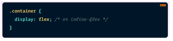
Display: A container; block or inline according to the given value. It enables the context for all its direct children.
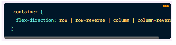
Flex-direction: Establish the main-axis which defines the direction for flex items in the container.
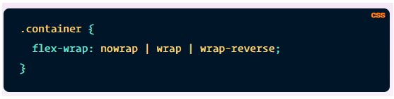
Flex-wrap: Flex items fit onto one line of the layout. You can allow the flex items to wrap as needed with flex-wrap.
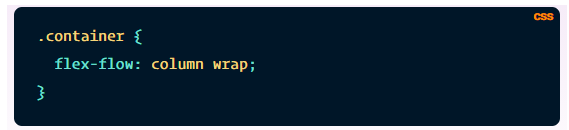
Flex-flow: Shorthand for flex-direction and flex-wrap, flex-flow defines main and cross axes for the container.
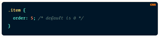
Order: By default, flex items exist in the source order. The order property controls this order in the flex container.
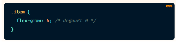
Flex-grow: This defines the growth ability for a flex item and accepts a unitless value to be used as a proportion. Flex-grow decides how much space an item should take in the flex container. If all items have one as flex-grow value, the remaining space is distributed equally to all items. In the case of 2, the remaining space takes twice as much space as the others.
What is a CSS grid?
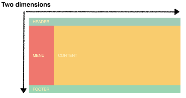
As the name suggests, CSS Grid is the most powerful grid-based layout system available in CSS. Unlike the 1-dimensional flexbox system, this 2-dimensional system can handle both rows and columns. To use the Grid Layout, you can apply CSS rules to a parent element (Grid Container) and to the container’s children (Grid Items).
We have been using CSS to layout web pages. But, it was not as good as the CSS grid layout is. With standard CSS, we used tables, floats, and positioning, all of which overlooked a lot of important functionality. Then Flexbox came into the picture. It is intended for a simpler one-dimensional layout, not complex two-dimensional ones. CSS Grid is the first CSS module that solves this layout problem.
CSS Grid Layout divides a page into major regions while defining relationships between each region, in terms of size, position, and layer.
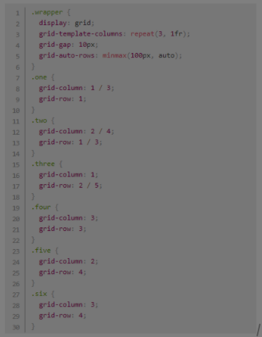
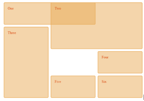
The following example shows a 3-column track grid with new rows at a minimum of 100 pixels and a maximum of auto (the allowable space on the screen):
Some of the most important terminologies in Grid are:
Grid Container: Direct parent of all grid items, grid container is the element on which display: the grid is applied. In the following example, the container is the grid container:
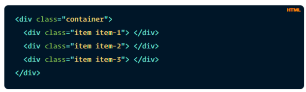
Grid Item: Grid item refers to the children or direct descendants of the grid container. In the example below, the item elements are grid items.
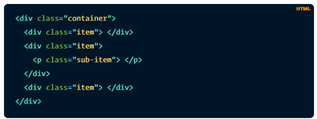
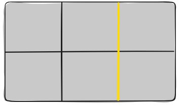
Grid Line: Gridlines are vertical and horizontal dividing lines that make up the structure of the grid. The lines can reside on either side of a column or a row. In the following example, the yellow line represents a column grid line.
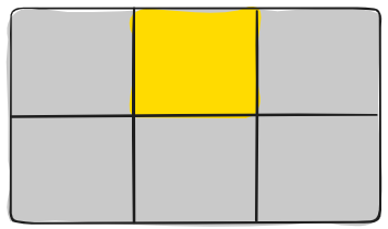
Grid Cell: Grid cell refers to space between two adjacent columns and two adjacent row grid lines. This is the single “unit” of the grid. In the example below, the grid cell between row lines 1 and 2, as well as column lines 2 and 3.
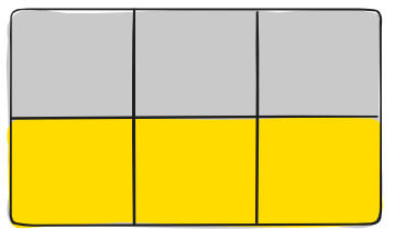
Grid Track: Grid track refers to the space between two adjacent grid lines – columns or rows of the grid. The example below shows the grid track between the third as well as second row grid lines:
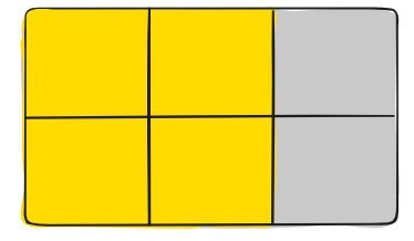
Grid Area: It refers to the total space with four grid lines surrounding it. A grid area may have any number of grid cells. The example below shows the grid area between column grid lines 1 and 3, and row grid lines 1 and 3.
Difference between Flexbox and Grid CSS
Dimensions are the first difference between both CSS Grid and Flexbox. Flexbox is a one-dimension layout technique, while CSS Grid enables two-dimensional web pages.
Content-first versus Layout-first
Flexbox is suitable when it comes to content-first styling, while CSS Grid forms the basis when it comes to the layout.
Alignment
Flexbox lets users fine-tune the alignments of web page elements. In this way, it helps to ensure exact specification sharing. Developers can use Flex Direction to align elements horizontally or vertically that are used while creating and reversing columns and rows.
Suppose you seek broader alignments in both dimensions at the same time. In that case, the CSS grid uses fractional measure units to achieve fluidity of the grid as well as auto-keyword functionality. It further adjusts rows or columns.
With this in-built automation provided by the CSS grid, developers don’t need to re-work regimes that may lead to confusing calculations.
Item Management
The parent element Flex Container can help to ensure a well-balanced representation of web pages by adjusting the dimensions of Flex Items. Due to this functionality, developers can design a responsive website for fluctuating sizes of screens.
In order to fine-tune this aesthetic, CSS Grid supports implicit and explicit placement of the content. It has inbuilt automation that lets developers automatically extend line items and copy values into the new creation from the preceding item.
"Gap" Property
Another notable difference between grid and flexbox is that the former lets you use grid-column-gap to create gutters between grid-items.
To achieve the result shown in this picture, flexbox developers use padding and nester containers. Alternatively, they can increase the flex container’s width and spread the flex-items by using the justify-content property.
In comparison, Grid CSS has a dedicated Gap property. Using this property, developers can create properly aligned boxes with the desired gap in all layout modes. These include table layouts, block layouts, and more.
Wraps
In case the total width of all items inside a container is greater than the container’s width, both CSS Grid and Flexbox provide an option to wrap the items in a new row. The difference exists in the way both handle wrapping.
When to use Flex and CSS Grid
One common misconception among developers is that CSS Grid is useful for full-page layouts, while Flexbox is ideal for smaller components. But that's not the case!
You have to assess each individually and see which one suits you the best in terms of your needs.
If your focus is content placement, then go for CSS Grid. Each item serves as a grid cell in this layout module, lined up horizontally or vertically along the axis. If you want to control the items' positions, then go for the CSS Grid layout.
But, you cannot predict such behavior if you are using Flexbox. You can set the heights and widths of the items and use the calc() function. But, in this case, you will lose the true essence of Flexbox – FLEXIBILITY.
Flexbox emphasizes on content flow but not content placement. Widths, as well as heights of all its items, are decided by the item’s content. Flex items shrink and grow based on their inner content as well as the available space.
On the other hand, Flexbox makes an ideal choice when you are focusing more on content flow instead of content placement. The content of the item defines the heights and widths of flex items.
Overall, Flexbox lets you allocate space and align-items with a high level of flexibility.
CSS Grid and Flexbox both grant developers control over their respective domains for designing responsive, flexible sites. However, you can combine the capabilities of both to create an extremely customizable, beautiful, and smooth experience.
But, if you have to choose one, then choose CSS Grid since it also combines all of Flexbox's capabilities into it.